
The journey of creating a beautiful quilt begins long before the first stitch. It starts with a vision, a pattern, and most importantly, color. The right color palette can transform a simple design into a stunning work of art, conveying mood, depth, and personality. With endless fabric choices, mastering color theory can feel overwhelming, but it doesn't have to be.
This guide is your comprehensive "how-to" for selecting fantastic color combinations for quilts and turning them into tangible projects you can replicate. We break down 8 proven color harmonies that guarantee beautiful results, moving beyond basic theory to offer practical examples and actionable tips for each. Whether you're aiming for a subtle monochromatic look or a vibrant triadic design, you'll find the specific insights needed to execute your vision confidently.
At B-Sew Inn, our commitment is to empower you through custom sewing machine designs, extensive resources, and dedicated support. This guide is more than just inspiration; it’s a practical tool to help you confidently select fabrics for your most ambitious projects. Supported by our extensive online classes and training, you'll gain the skills to bring any color concept to life. Let's explore the palettes that will make your next quilt your most breathtaking one yet.
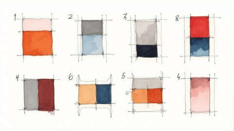
1. Monochromatic Color Scheme
A monochromatic color scheme uses a single color family to create a quilt that is both sophisticated and visually cohesive. This approach explores the full potential of one hue by utilizing its various shades (adding black), tints (adding white), and tones (adding gray). The result is a harmonious design with subtle yet compelling depth, making it one of the most elegant color combinations for quilts.
This technique is incredibly versatile and perfect for replicating specific designs. For a serene and calming effect, create a "Ocean Waves" quilt using a spectrum of blues, from deep navy and royal blue to soft sky and powder blue. A tangible project for modern quilters is a stunning gradation quilt, where colors seamlessly transition from light to dark across a simple log cabin block, showcasing precision piecing. Even traditional styles, like the iconic neutral quilts of Amish communities, rely on monochromatic palettes of beige, cream, and tan to achieve their timeless appeal.
Mastering the Monochromatic Palette
The key to a successful monochromatic quilt is creating sufficient contrast to prevent the design from appearing flat. Here are some actionable tips:
- Value is Everything: Intentionally select fabrics from the lightest and darkest ends of your chosen color's spectrum. This high contrast in value will make your quilt blocks and patterns stand out.
- Incorporate Texture: When working with a limited color palette, texture becomes a powerful tool. Mix different fabric types like cotton, linen, velvet, or corduroy to add tactile and visual interest. The way light hits each texture will create subtle variations in color.
- The 5% Accent Rule: For a dynamic pop, consider introducing a tiny amount of an accent color. This should make up no more than 5% of the quilt top. A sliver of bright yellow in a gray quilt or a hint of orange in a blue design can elevate the entire piece.
To help you master this technique, the summary box below visualizes these core principles for creating a dynamic monochromatic quilt.
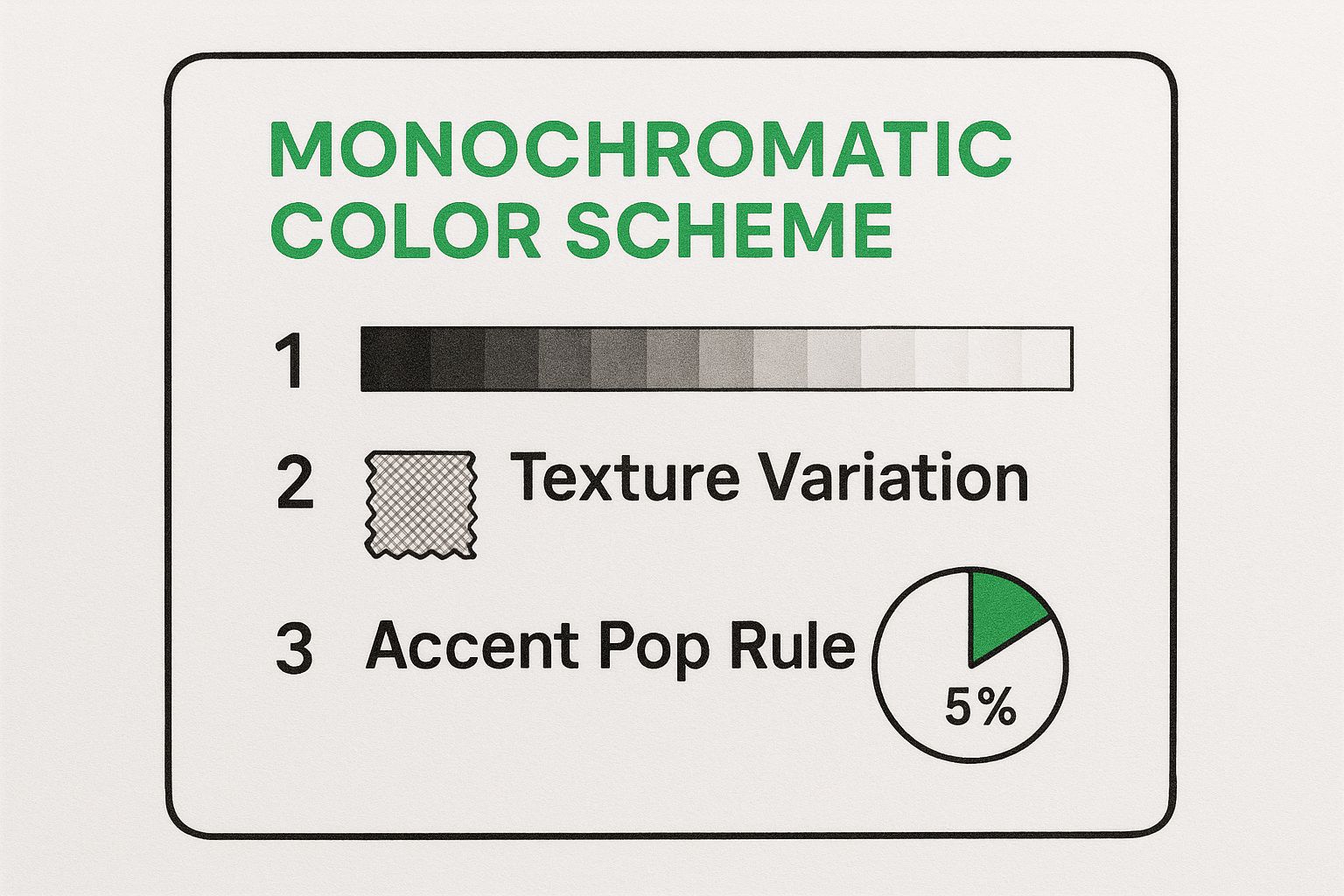
This quick reference highlights how combining a full range of values, varying textures, and a small accent can transform a single-color concept into a sophisticated and impactful design. At bsewinn.com, our online classes delve into color theory, helping you gain the confidence to apply concepts like these to your own unique quilting projects.
2. Complementary Color Harmony
A complementary color harmony uses colors positioned directly opposite each other on the color wheel to create quilts that are energetic and visually striking. This high-contrast pairing creates a natural tension that makes each color appear brighter and more vivid, resulting in some of the most dynamic color combinations for quilts. The inherent vibrancy makes this scheme perfect for designs intended to grab attention and radiate energy.
This classic approach is found in many beloved quilt styles you can replicate. Traditional Christmas quilts capitalize on the festive contrast of red and green in a "Peppermint Swirl" block design. For a stunning project, create a sunset-themed quilt using a flying geese pattern where orange fabrics soar across a deep blue background. For a quilt that evokes a spring garden, the combination of purple and yellow provides a cheerful and lively feel in a simple four-patch block design.
Mastering the Complementary Palette
The key to a successful complementary quilt is managing its high energy to avoid a design that feels overwhelming. Here are some actionable tips:
- Use Unequal Proportions: Avoid using a 50/50 split of the two colors. Instead, let one color dominate (around 60-70%) and use the other as a vibrant accent. This creates a more balanced and sophisticated look.
- Incorporate Neutrals: Introduce neutral colors like white, cream, gray, or black to give the viewer's eye a place to rest. Neutrals can act as a buffer, softening the intense contrast between the complementary hues.
- Vary the Intensity: You don’t have to use fully saturated versions of each color. Mix tints, shades, and tones of your complementary pair. For example, pair a deep navy with a soft peach instead of a bold blue and bright orange for a more subtle effect.
- Try a Split-Complementary Scheme: For a softer but still vibrant look, use one color and the two colors adjacent to its complement. This provides high contrast with less direct tension.
At bsewinn.com, we believe that understanding color theory is fundamental to creative expression. Our online classes provide the hands-on training and extensive resources you need to confidently select fabrics and create stunning color combinations for quilts, turning your vision into a beautiful reality.
3. Analogous Color Palette
An analogous color palette uses three to five colors that sit right next to each other on the color wheel. This creates a beautifully harmonious and serene design that is naturally pleasing to the eye. This approach is one of the most popular color combinations for quilts because it often mimics the subtle color progressions found in nature, resulting in a design with a gentle, unified flow and a rich, layered appearance.
This technique is exceptionally effective for creating quilts with a strong thematic feel. As a tangible project, you can craft an ocean-themed quilt blending blue, blue-green, and green in a "Storm at Sea" pattern to capture the water's shifting depths. For another replicable design, create a vibrant autumn quilt using a simple maple leaf block, showcasing the progression from red and red-orange to bright yellow.
Mastering the Analogous Palette
The key to a successful analogous quilt is balancing harmony with visual interest to ensure the colors work together without blending into a single mass. Here are some actionable tips:
- Choose a Dominant Hue: Select one of the colors to be the star of your quilt, using the others as supporting accents. For example, in a red, orange, and yellow palette, you might make orange the dominant color to create a warm, inviting feel.
- Play with Value and Temperature: Incorporate light and dark values of each of your chosen colors to build contrast and depth. Also, decide whether your quilt will have a warm (reds, oranges, yellows) or cool (blues, greens, purples) temperature to set the overall mood.
- Add a Complementary Pop: For a touch of excitement, introduce a very small amount of the complementary color to your dominant hue. A tiny splash of blue in an orange-dominant quilt, for instance, can make the entire design feel more dynamic and vibrant.
Understanding how colors relate is crucial, and a good color chart can be an invaluable tool. To explore these relationships further, you can find a comprehensive embroidery thread color chart on bsewinn.com that helps visualize these concepts. At bsewinn.com, our online classes and extensive resources are designed to help you confidently build beautiful palettes for all your quilting projects.
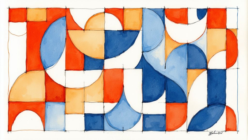
4. Triadic Color Scheme
A triadic color scheme uses three colors that are evenly spaced around the color wheel, creating a high-contrast palette that is simultaneously balanced and harmonious. This approach delivers a vibrant, dynamic visual effect, making it one of the most exciting and versatile color combinations for quilts. The inherent relationship between the three hues ensures they work together beautifully, even with strong contrast.
This classic technique is the foundation for some of the most iconic quilt designs. A perfect tangible project is a traditional American quilt featuring the primary triad of red, blue, and yellow in a "Trip Around the World" pattern. Modern quilters can replicate this by exploring secondary triads, such as orange, green, and purple, to create a playful and contemporary "Half-Square Triangle" quilt. The key is that the three colors create a triangle on the color wheel, which guarantees a pleasing and energetic result.
Mastering the Triadic Palette
The biggest challenge with a triadic scheme is managing its inherent vibrancy to avoid overwhelming the quilt design. Here are some actionable tips:
- Establish a Dominant Color: Choose one of the three colors to be the star of your quilt, making up roughly 60% of the design. Use the other two as supporting accents. This creates a clear focal point and prevents visual competition.
- Use Neutrals to Balance: Incorporate neutrals like white, cream, gray, or black to give the eye a place to rest. Sashing, borders, or background fabrics in a neutral shade will make the triadic colors pop without clashing.
- Vary Intensity and Value: Instead of using three pure, fully saturated hues, play with their tints, tones, and shades. For example, pair a deep navy blue with a soft peach (a tint of orange) and a dusty lavender (a tone of purple) for a sophisticated take on a triadic scheme.
A well-executed triadic quilt feels both lively and intentional. At bsewinn.com, our online classes and extensive resources explore color theory fundamentals, empowering you to confidently choose and balance powerful palettes like this one for your own custom sewing machine designs.
5. Split Complementary Harmony
A split complementary color scheme offers a sophisticated twist on the classic complementary pairing, providing high contrast with less tension. This scheme takes a base color from the color wheel and pairs it not with its direct opposite, but with the two colors located on either side of its complement. The result is a vibrant yet balanced palette that delivers strong visual interest, making it one of the most versatile color combinations for quilts.
This approach gives quilters more creative freedom. For a tangible project, you could build a stunning quilt around a dominant blue, accented with pops of both red-orange and yellow-orange in a modern geometric pattern for a warm, dynamic effect. Another beautiful design to replicate is pairing a primary red with accents of blue-green and yellow-green in a floral appliqué quilt, creating a look that feels both energetic and natural. This color harmony is perfect for creating quilts that are eye-catching without being visually overwhelming.
Mastering the Split Complementary Palette
The key to a successful split complementary quilt is balancing the three colors to create a cohesive and pleasing design. Here are some actionable tips:
- Establish a Dominant Color: Choose one of the three colors to be the star of your quilt. The base color often works best as the dominant hue, using the two adjacent colors as accents.
- Balance with Neutrals: To prevent the vibrant combination from becoming too chaotic, incorporate neutral fabrics like cream, gray, or soft beige. These will give the eye a place to rest and make the main colors pop even more.
- Vary the Proportions: Avoid using all three colors in equal amounts. A good rule of thumb is a 60-30-10 distribution, where your dominant color makes up 60% of the quilt, a secondary color 30%, and the third color is used for small, impactful accents at 10%.
- Consider Print and Scale: Play with the scale of your fabric prints. Use larger-scale prints for your dominant color and smaller, more subtle prints for your accent colors to guide the viewer's eye and add depth to the overall design.
This balanced approach creates quilts with a lively yet harmonious feel, perfect for both modern and traditional patterns. At bsewinn.com, our online classes on color theory explore concepts like these in depth, providing you with the skills to confidently select and combine fabrics for any project you can imagine.
6. Neutral and Natural Color Palette
A neutral and natural color palette uses timeless earth tones like beige, brown, gray, and cream to create quilts that are serene, sophisticated, and incredibly versatile. This approach focuses on colors found in nature, resulting in designs that are calming and coordinate effortlessly with almost any home décor. The quiet elegance of a neutral quilt allows the piecing and quilting stitches to become the star of the show.
This color scheme is a favorite in both traditional and modern quilting. A great tangible project for a modern quilter is a minimalist quilt featuring a stark progression of white, cream, and gray in an improv-pieced design to create a powerful graphic statement. Similarly, you can replicate a traditional whole-cloth quilt made from un-dyed linen or cotton, which relies on intricate quilting stitches rather than color for its subtle beauty. This palette proves that you don't need bright colors to make a memorable and impactful design.
Mastering the Neutral Palette
The success of a neutral quilt lies in creating depth and interest without relying on vibrant hues. The key is to manipulate value and texture to build a dynamic composition.
- Vary Your Values: A common pitfall with neutrals is creating a "flat" or muddy-looking quilt. Avoid this by selecting a wide range of values, from the lightest whites and creams to the deepest charcoals and chocolates. High contrast is crucial for defining your pattern.
- Mix Warm and Cool: Combine warm neutrals (like tan, beige, and taupe) with cool neutrals (like slate gray, silver, and dove gray) to add complexity and prevent the palette from feeling one-dimensional.
- Embrace Texture: When color is subtle, texture becomes paramount. Mix fabrics like chunky linen, smooth cotton, soft flannel, and even corduroy. The way light interacts with these different surfaces will create rich visual interest.
- Add a Single Pop of Color: Just like a monochromatic scheme, a neutral quilt can be elevated with a tiny, unexpected accent color. A sliver of burnt orange, a hint of olive green, or a touch of dusty blue can bring the entire piece to life.
For those just starting their quilting journey, a neutral palette can be an excellent way to focus on fundamental skills. A comprehensive guide like our quilting for beginners step-by-step can help you master the techniques needed to create a beautiful neutral quilt. At bsewinn.com, we champion the idea that even the simplest color combinations for quilts can produce stunning, heirloom-quality work.
7. Rainbow and Multi-Color Spectrum
A rainbow or multi-color spectrum scheme embraces the full joy of the color wheel, incorporating a wide variety of hues into a single, vibrant design. This energetic approach celebrates color in its purest form, resulting in dynamic, joyful quilts that are full of life and movement. Far from being chaotic, this method can create some of the most visually stunning and emotionally resonant color combinations for quilts when handled with care.
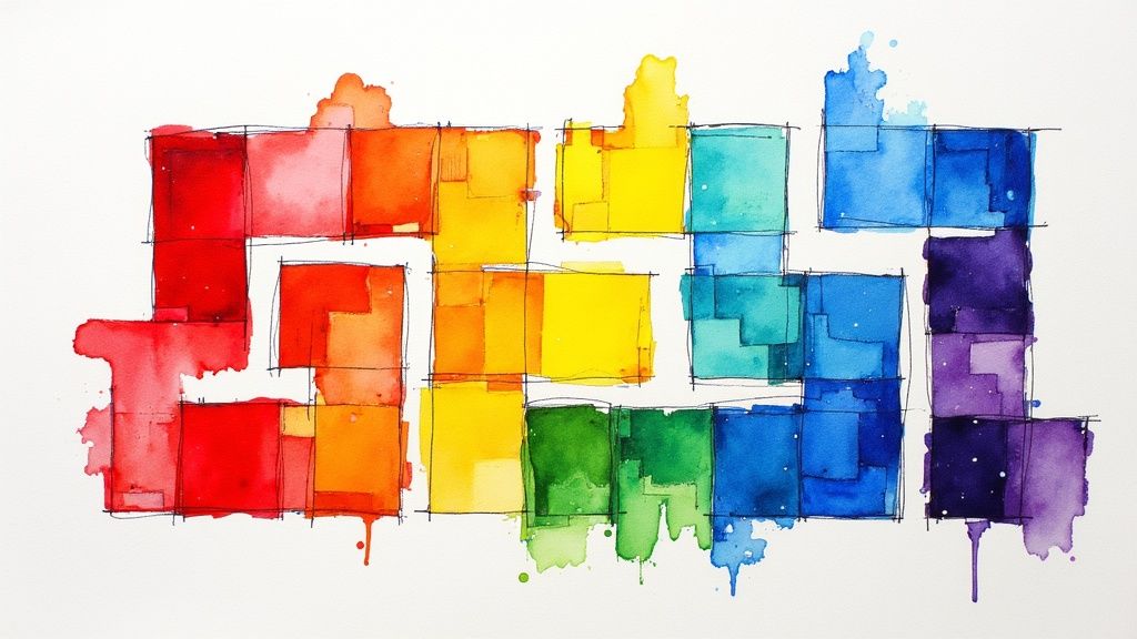
This technique is the heart and soul of traditional scrap quilts, which historically made use of every available fabric scrap. A fantastic replicable project is a meticulously planned rainbow log cabin quilt, where each block transitions through the color spectrum. Children's quilts often feature bright, cheerful spectrums in simple patchwork designs. The key is finding a way to make a diverse range of colors work together in harmony.
Mastering the Rainbow Palette
The challenge of a multi-color quilt is creating unity and preventing the design from feeling overwhelming. Here are some actionable tips:
- Introduce a Unifying Neutral: Incorporate a consistent neutral like crisp white, soft gray, or deep charcoal as a background or sashing. This gives the eye a place to rest and makes the vibrant colors pop even more.
- Maintain Consistent Value: To create a cohesive look, select fabrics that share a similar value (lightness or darkness), even if their hues are different. A quilt made entirely of bright, saturated jewel tones will feel more unified than one mixing pastels and darks randomly.
- Organize Your Chaos: Arrange your colors intentionally. A classic rainbow order (ROYGBIV) is always effective, but you can also group colors by temperature (warm vs. cool) or create a subtle gradation from light to dark across the quilt top.
- Plan for Balance: Pay attention to where you place each color. Avoid clustering too many "heavy" or dark colors in one area. Distribute them evenly to achieve a balanced and pleasing composition.
A multi-color spectrum is a fantastic way to use up your fabric stash and express a sense of pure fun. At bsewinn.com, our online classes cover advanced color theory, helping you gain the skills to confidently tackle complex palettes like this and turn a collection of scraps into a masterpiece.
8. Warm and Cool Color Temperature Combinations
A sophisticated approach to creating dynamic quilts involves pairing warm and cool colors. This method leverages the natural division of the color wheel into warm hues (reds, oranges, yellows) and cool hues (blues, greens, purples). Juxtaposing these two families creates a powerful visual tension and contrast, resulting in quilts that feel vibrant, balanced, and full of life.
This technique is frequently used to create tangible designs that evoke specific moods or scenes. A stunning replicable project is a sunset quilt where fiery oranges and yellows (warm) transition into cool purples and deep blues of the night sky using a simple strip-piecing method. Similarly, a garden-themed quilt can come alive by placing warm, bright flower colors like red and pink against a backdrop of cool green foliage and blue accents. This play on temperature is one of the most effective color combinations for quilts that aim to tell a story or create an atmosphere.
Mastering the Warm and Cool Palette
The key to a successful warm and cool color combination is balance and intention. You can create harmony or high drama depending on how you wield these temperatures. Here are some actionable tips:
- Establish Dominance: To avoid a chaotic look, allow one temperature to dominate the quilt (around 60-70%) while using the other as an accent. A mostly cool blue quilt with pops of warm orange will feel more cohesive than a 50/50 split.
- Create a Focal Point: Use temperature contrast to draw the eye. Placing a single warm element in a field of cool colors, or vice versa, immediately creates a powerful focal point for your design.
- Bridge the Gap: Incorporate neutrals like gray, beige, or cream to create a visual resting place between intense warm and cool sections. You can also use "in-between" colors like yellow-green or red-violet to create a smoother transition.
- Enhance with Stitches: The texture and color of your thread can amplify this effect. Using a warm-colored thread for decorative stitching on a cool fabric can add another layer of sophisticated contrast. To learn more, explore our top tips for beautiful decorative stitches.
At bsewinn.com, we believe that understanding color theory is a superpower for quilters. Our online resources and training are designed to help you confidently mix and match colors, transforming your creative vision into a stunning finished piece.
Color Scheme Comparison of 8 Quilt Palettes
| Color Scheme | Implementation Complexity 🔄 | Resource Requirements ⚡ | Expected Outcomes 📊 | Ideal Use Cases 💡 | Key Advantages ⭐ |
|---|---|---|---|---|---|
| Monochromatic Color Scheme | Low - straightforward color matching | Low - uses one base color family | Elegant, unified, subtle depth & texture emphasis | Complex piecing patterns, sophisticated designs | Foolproof matching, elegant, pattern-focused |
| Complementary Color Harmony | Medium - requires careful balance | Medium - opposite colors required | Vibrant, high contrast, very eye-catching | Bold quilts, focal points, traditional & modern | Maximum vibrancy, strong impact, timeless appeal |
| Analogous Color Palette | Low to Medium - neighboring colors | Low - colors naturally blend | Harmonious, natural flow, subtle variety | Nature-inspired, restful designs, landscapes | Easy to coordinate, pleasing, creates flow |
| Triadic Color Scheme | Medium - balancing three colors | Medium - multiple distinct colors | Vibrant yet balanced, varied, harmonious | Geometric, traditional, visually engaging quilts | Good variety, balance, flexible dominance |
| Split Complementary Harmony | Medium to High - more colors & balance | Medium to High - mix of neighbors | Strong contrast with subtlety, sophisticated | More complex quilts needing contrast without harshness | Easier than pure complementary, flexible, softer |
| Neutral and Natural Color Palette | Low - uses earth tones | Low - widely available fabrics | Calm, timeless, coordinates easily with décor | Minimalist, modern, restful home quilts | Timeless, versatile, highlights texture & technique |
| Rainbow and Multi-Color Spectrum | High - managing many colors | High - diverse fabric colors | Energetic, joyful, dynamic, playful | Scrap quilts, children’s quilts, vibrant designs | Extremely versatile, joyful, uses varied fabrics |
| Warm and Cool Temperature Combos | Medium - balancing temp contrast | Medium - warm & cool families | Natural depth, dynamic tension, seasonal/nature themes | Nature-inspired, seasonal, dimensional quilts | Natural depth, easy to apply, flexible effects |
Bring Your Color Vision to Life with B-Sew Inn
Navigating the world of color theory is one of the most exciting aspects of quilting. We've journeyed through eight distinct and powerful color combinations for quilts, each offering a unique language to express your artistic vision. From the subtle sophistication of a monochromatic scheme to the vibrant energy of a triadic or rainbow palette, you now have a comprehensive toolkit to build stunning and harmonious designs.
Understanding these foundational palettes, such as the dynamic push-and-pull of complementary colors or the gentle, cohesive flow of an analogous selection, is the first step. The true mastery comes in applying this knowledge to fabric, thread, and stitch. The goal is to move beyond theory and create quilts that not only look beautiful but also feel intentional and emotionally resonant.
From Inspiration to Execution: Your Quilting Partner
Choosing your colors is the "what"; bringing them to life with precision and flair is the "how." This is where your tools and skills make all the difference. Executing the sharp, clean lines demanded by a bold complementary design or the delicate gradients of a monochromatic quilt requires a machine you can trust and the confidence to use it to its full potential.
This is the core of our mission at B-Sew Inn. We are committed to empowering crafters to achieve their creative goals. We understand that turning a palette of fabric swatches into a finished masterpiece involves more than just a great idea. It requires support, education, and a community that shares your passion.
Actionable Next Steps for Your Quilting Journey
With these color concepts in mind, you are ready to take tangible steps toward your next project. Here’s how you can translate inspiration into a beautifully finished quilt:
- Select Your Palette: Choose one of the color schemes from this article that resonates with your project idea. Gather fabric swatches to see how the colors interact in person.
- Skill Up for Success: Identify a technique you want to master for your project. Whether it's free-motion quilting to add texture to a neutral quilt or precise piecing for a complex triadic pattern, targeted learning is key.
- Leverage Expert Resources: Instead of guessing, lean on proven expertise. Our extensive library of online classes and training resources is designed to guide you through every challenge, from basic machine setup to advanced custom embroidery.
Mastering these color combinations will fundamentally elevate your quilting. It allows you to create with intention, control the mood of your work, and produce heirloom-quality pieces that tell a story. The B-Sew Inn community is here to support you at every stitch, ensuring you have the tools, knowledge, and encouragement to transform your creative vision into a tangible, beautiful quilt you can be proud of.
Ready to turn these color combinations for quilts into your next masterpiece? Explore the precision machines, expert training, and supportive community at B-Sew Inn. Let us provide the tools and education you need to bring your most colorful and ambitious quilting projects to life.