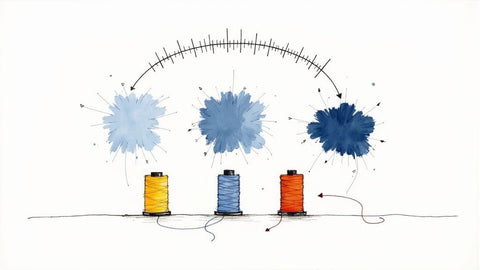
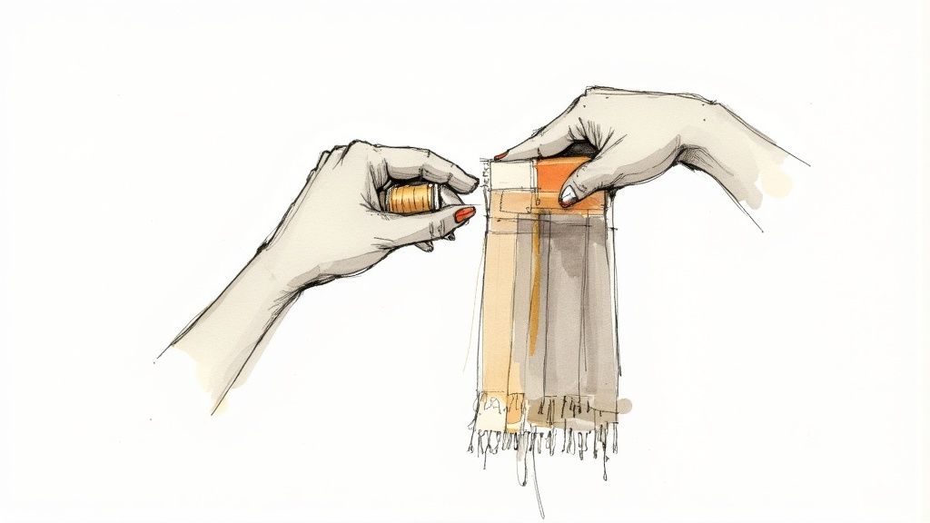
If you've ever held a skein of embroidery thread and wondered how to make sure it matches your project perfectly, you've discovered the need for a good thread color chart. Think of it as the ultimate cheat sheet for your craft, organizing every shade by number so you can get your color matching and consistency just right. It takes all the guesswork out of the equation, ensuring your finished piece looks exactly like what you imagined.
Why a Thread Color Chart is a Must-Have for Embroidery
Let's be honest: achieving precise, consistent color is what elevates embroidery from a simple craft to a true art form. A master embroidery thread color chart is the one tool that can get you there, acting like a universal language for every shade imaginable. It completely eliminates that frustrating game of color-selection roulette.
Instead of squinting at spools under weird lighting, a standardized chart gives you a reliable, true-to-life reference. This means your finished project will always match your original vision, whether you're following a pattern someone else designed or bringing your own creation to life. It’s all about having the confidence to translate your ideas accurately.
These charts are also absolute lifesavers when you need to substitute one brand for another. If a pattern calls for a specific brand you don’t have on hand, a good conversion chart helps you find the closest match in seconds. No more project delays or last-minute trips to the store!
Here at bsewinn.com, we believe that empowering crafters through our custom sewing machine designs is everything. It's a commitment you'll see in the extensive resources, online classes, and training we offer. Mastering your tools—especially a color chart—is a huge step toward creating professional-quality embroidery, and we're here to support you every step of the way on your creative journey.
How Thread Material Affects Color and Sheen
Ever noticed how the same color number can look completely different depending on the brand? It’s not your eyes playing tricks on you. The material the thread is made from plays a huge part in how the color shows up in your final piece.
The fiber content directly changes the thread's luster, or sheen. This is something you really have to keep in mind when you're looking at an embroidery thread color chart for substitutions. The two big players you'll see everywhere are Rayon and Polyester.
Rayon vs. Polyester Sheen
Rayon is famous for its brilliant, almost-blinding sheen that catches the light beautifully. This quality makes colors look incredibly vibrant and gives your embroidery a silky, almost luxurious feel. It’s my go-to for decorative projects where I really want the colors to sing.
Polyester, on the other hand, is a bit more understated with a semi-gloss sheen. It's tough as nails and incredibly colorfast, making it the perfect workhorse for anything that's going to see a lot of washing. While the colors are still bright, they have a softer look compared to rayon's high-wattage shine.
A thread's material doesn't just change the look; it changes the feel. A design stitched in high-sheen rayon will have a different tactile quality than the same design stitched in durable polyester, adding another layer of artistry to your work.
Cotton and Other Materials
Stepping away from synthetics, you've got your classic cotton embroidery floss, which gives a soft, matte finish. I love this traditional look for projects where I'm going for a more subtle or vintage vibe.
And it’s not just us crafters who are noticing. The global hand embroidery threads market is expected to hit $1.5 billion by 2025, which is just incredible. This boom is fueled by a real passion for personalized, handmade items. You can dive deeper into these market trends and their impact on thread availability. This explosion in variety is great news for anyone using bsewinn.com's custom designs, as it gives you the power to find the perfect material to bring your vision to life.
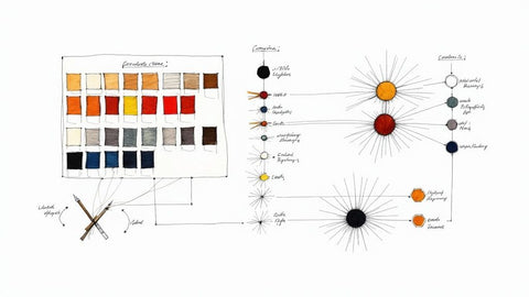
The Ultimate Thread Conversion Chart
We’ve all been there. You find the perfect embroidery pattern, you’re excited to start, and then you hit a wall. The pattern calls for a specific DMC shade, but your stash is full of Anchor or Madeira. It can feel like trying to match paint swatches in a dimly lit room, and it’s enough to make you put the project aside before you even make the first stitch.
That’s exactly why a reliable embroidery thread conversion chart is one of the most important tools in your kit. Think of this as your go-to reference guide. We’ve organized it numerically by DMC, since it's the brand you'll see most often in patterns, making it super fast to look up what you need. No more guessing games or trips to the store for a single color—just find your number and get back to what you love.
This chart highlights some of the most popular and timeless embroidery thread palettes that crafters like you turn to again and again.
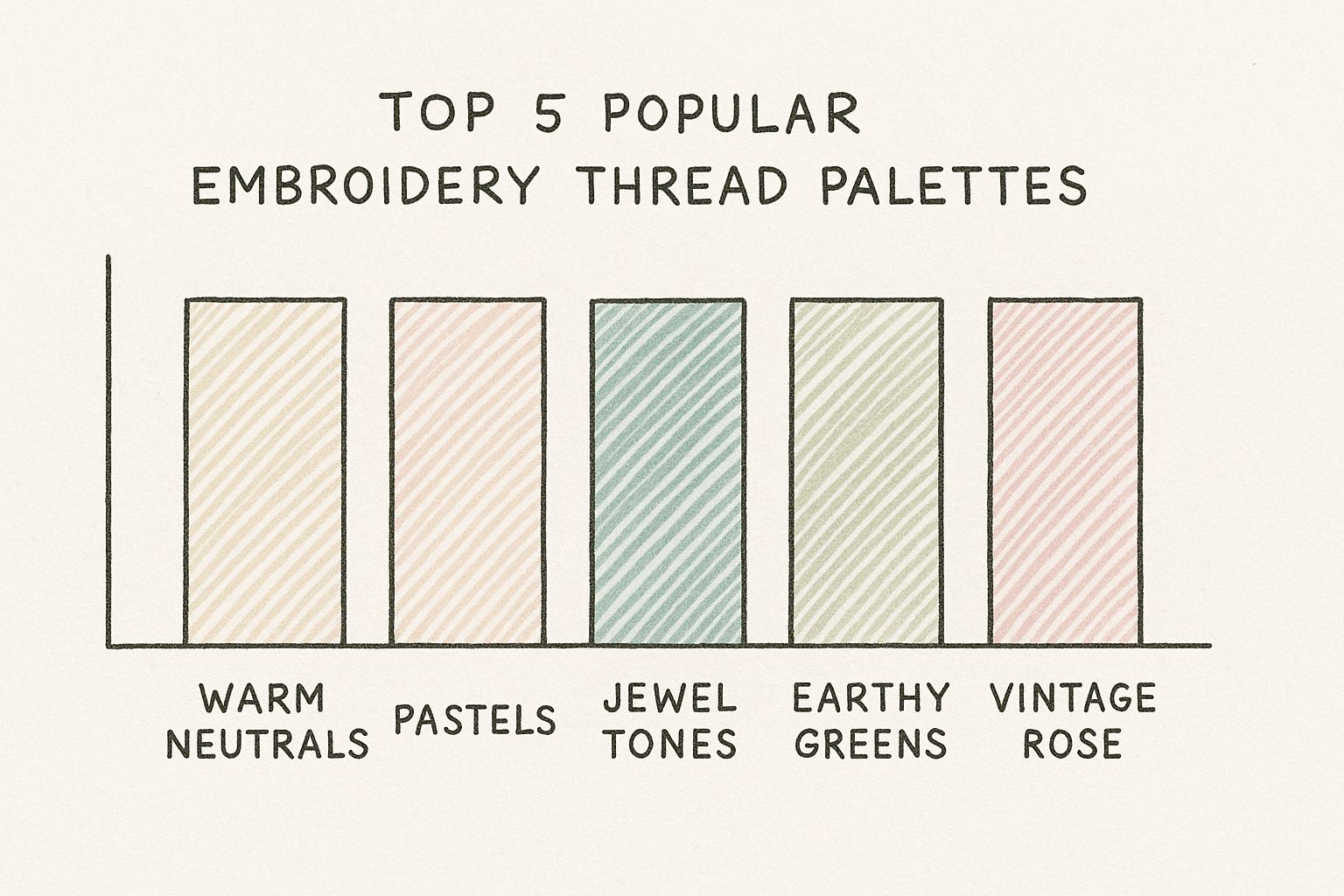
From the cozy Warm Neutrals to the deep, vibrant Jewel Tones, this gives you a great visual for planning out cohesive color stories for your next project.
How To Get The Most Out Of The Conversion Chart
It’s important to remember that while these conversions are incredibly close, they aren’t always a perfect 1-to-1 match. Tiny variations happen because of different dye lots, manufacturing processes, and even the natural sheen of the thread itself. A shiny rayon thread, for instance, is going to catch the light differently than a matte cotton floss, which can make the color look slightly different in your finished piece.
My best advice? Use this chart as your main guide, but if you’re working on a project where exact color matching is critical, take a moment to compare the physical threads side-by-side in natural light. It’s a quick step that ensures the final piece looks exactly how you envisioned it.
This chart is just one of the many ways we at bsewinn.com want to support your creative journey. By providing handy tools like this alongside our custom sewing machine designs and expert training, we hope to build your skills and give you the confidence to bring any idea to life.
Embroidery Thread Conversion Chart (DMC, Anchor, Madeira)
Use this table to find the closest color match for popular embroidery thread brands.
| DMC Number | DMC Color Name | Anchor Equivalent | Madeira Equivalent |
|---|---|---|---|
| 310 | Black | 403 | 2400 |
| B5200 | Snow White | 2 | 2402 |
| 743 | Med Yellow | 298 | 2608 |
| 972 | Deep Canary | 306 | 2605 |
| 666 | Bright Red | 46 | 2447 |
| 816 | Garnet | 47 | 2449 |
| 995 | Dk Electric Blue | 140 | 2516 |
| 915 | Dk Plum | 110 | 2555 |
| 906 | Med Parrot Green | 256 | 2616 |
| 434 | Lt Brown | 359 | 2712 |
Hopefully, this handy table saves you some time and a bit of frustration on your next project! Having these common conversions ready to go makes it so much easier to adapt patterns and use the beautiful threads you already have.
Matching Threads to Digital Color Codes
It’s a familiar story for anyone who embroiders: the color you picked on your computer screen looks completely different once it’s stitched out. That perfect shade of sky blue suddenly looks more like a dusty periwinkle, and all that careful planning feels wasted. This is precisely why getting a handle on digital color codes like HEX and RGB is such a game-changer.
Think of these codes as a universal language for color. When you can match a specific code to a manufacturer's thread chart, you take all the guesswork out of your palette. It lets you plan your entire project with total confidence, knowing that the colors in your digital mock-up will be a perfect match for the threads you buy.
From Screen to Fabric: A Digital Color Guide
More and more, projects are born in design software before a single thread is pulled. Being able to plug in the exact HEX code for DMC 310 Black or find the right RGB value for DMC 666 Bright Red is incredibly powerful. It closes that frustrating gap between your digital vision and the finished piece. If you want to dive deeper into this world, our guide on how to digitize embroidery designs is a great place to start.
The demand for perfect color is huge, and it’s a big reason why the global embroidery thread market was valued at around $4.5 billion in 2024. Tools like a reliable color chart are what allow stitchers to create with precision.
I've put together this reference table to be your go-to for flawless color matching. You can use it to pinpoint the exact HEX or RGB values needed in your design software, ensuring what you see on screen is what you get on fabric.
Digital Color Codes for Popular DMC Threads
| DMC Number | Color Name | HEX Code | RGB Value |
|---|---|---|---|
| 310 | Black | #000000 | 0, 0, 0 |
| B5200 | Snow White | #FFFFFF | 255, 255, 255 |
| 666 | Bright Red | #D40000 | 212, 0, 0 |
| 972 | Deep Canary | #FAA905 | 250, 169, 5 |
| 995 | Dk Electric Blue | #2B65EC | 43, 101, 236 |
| 906 | Med Parrot Green | #008B00 | 0, 139, 0 |
Hopefully, this chart makes bridging the digital-to-physical divide a little easier for your next project
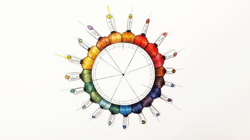
How to Build a Beautiful Color Palette
Think of your embroidery thread color chart as a map. It's an amazing tool, but the real magic happens when you start charting your own course. Moving beyond a pattern’s suggested colors is how you inject your own artistic voice into a project, and it all starts with getting comfortable with a little color theory.
Once you learn a few foundational color schemes, you'll have a framework for building gorgeous, harmonious palettes that make your designs truly sing. It's a skill that just takes a little practice.
Mastering Color Harmonies
Let's walk through three classic color schemes you can build using any thread chart:
-
Complementary: These are colors sitting directly opposite each other on the color wheel, and they create incredible contrast. For a bold, eye-catching effect, try pairing a bright red (like DMC 666) with a vibrant green (DMC 906). They just pop!
-
Analogous: This scheme uses colors that are neighbors on the color wheel. The result is always serene and cohesive. Imagine blending a deep plum (DMC 915) with a rich blue for a smooth, calming feel.
-
Triadic: Ready for something a little more dynamic? A triadic scheme uses three colors that are evenly spaced on the wheel. This creates a palette that's balanced but still full of life. For a perfect example of this harmony in action, check out the rich jewel tones in our Madeira Aeroquilt Jewel Tones pack.
Building a palette is about more than just matching; it's about telling a story with color. Each combination sets a different mood, giving you control over the final feel of your embroidery.
This level of creativity is what drives the global embroidery industry, a market valued at around $2.57 billion back in 2021. As you can see in this embroidery market report, color charts are essential tools that help stitchers everywhere find the perfect shades for all sorts of styles. Here at bsewinn.com, we champion this skill through online classes designed to help you master color theory and make every design your own.
Take Your Skills to the Next Level with Bsewinn
This color chart is a great starting point, but it's really just the beginning of what we offer at bsewinn.com to help you grow. We are committed to empowering crafters by providing not only top-notch custom sewing machine designs but also the extensive resources and support needed to bring those designs to life. The whole reason we're here is to support you from that first spark of an idea to the final, perfect stitch.
For instance, you can use the color conversion charts in this guide to create a stunning floral monogram on a tote bag using one of our custom alphabet designs. Or, apply the digital color matching techniques to perfectly replicate a company logo for a set of custom work shirts. Our resources are designed to give you tangible skills for real-world projects.
We've put together a full library of helpful guides, in-depth training modules, and fun online classes to explore. And for those of you looking to really dive deep into digital design, you should definitely check out powerful tools like the Baby Lock Palette 11 Embroidery Software. It opens up a whole new world of creative possibilities.
At Bsewinn, our mission is to empower you. We want to give you the resources and support to take your embroidery from simply great to truly exceptional, making sure you feel confident with every project.
I really hope you'll take a moment to explore everything we have to offer. We'd love to partner with you on your creative journey.
Questions We Hear All the Time About Thread Charts
When you're deep into a project, the last thing you want is to get stuck on a thread color. Diving into a color chart can sometimes feel like solving a puzzle, especially when you're trying to sub a brand or match something you saw on screen. We get it, and we've heard a lot of these same questions from fellow stitchers.
One of the biggest questions that comes up is whether color conversions are truly a 100% perfect match. The short answer? Not quite. Think of them as the closest possible shade, not an identical twin. You’ll often see tiny differences because of dye lots or how shiny one thread is compared to another. That’s why, for those really important projects, it’s always a great idea to compare the physical threads in good, natural light.
Solving Common Conversion Issues
Okay, so what happens when a color you desperately need has no direct conversion on the chart? Don't panic! You've got a couple of solid options.
- Look Next Door: Check out the colors that are numerically right next to the one you need. More often than not, a shade that's just a tiny bit lighter or darker in the brand you have will work beautifully without anyone ever knowing the difference.
- Keep the Vibe: The real goal is to maintain the overall feel and color balance of the original design. Just pick a substitute that plays nicely with the rest of your color palette, and you'll be golden.
Another thing we get asked about is mixing different thread brands in one project. Go for it! It's absolutely fine to do. The only thing to keep in mind is that for a totally consistent look, you'll want to use threads with a similar finish. Mixing a super shiny rayon with a matte cotton, for example, will create a difference in texture—which can be a stunning design choice if that's what you're going for!
Here at B-Sew Inn, our passion is giving you the tools, custom designs, and know-how to bring any creative idea to life. Come explore all our resources and see how we can help you create with total confidence at https://www.bsewinn.com.