

If you’ve ever felt a little lost staring at a wall of beautiful fabrics, wondering how to possibly choose the right ones, you’re not alone. The secret weapon that transforms that guesswork into a confident, creative process is the humble color wheel for quilters. Think of it as your visual roadmap—a tool that shows you exactly how colors play together, helping you build stunning palettes for any project you dream up.
Truly, learning to use it is the magic behind the most memorable quilts, allowing you to create beautiful designs you can replicate time and time again.
Why a Color Wheel Is Every Quilter's Best Friend
In quilting, color isn’t just about filling in the blanks of a pattern. It’s the soul of the quilt. It tells a story, sets a mood, and guides the eye across your hard work. But without a game plan, a stack of gorgeous fabrics can quickly turn into a chaotic mess once they're all sewn together.
This is where the color wheel becomes your most trusted guide. It helps you make intentional, impactful choices. Instead of wandering the aisles of a fabric store feeling overwhelmed, you can walk in with a clear vision. The color wheel gives you a time-tested framework for pulling together amazing combinations, whether you're aiming for a soft, serene baby quilt or a bold, modern wall hanging.
Building Confidence and Skill
Working with a bit of color theory completely removes that feeling of uncertainty. It’s incredibly empowering to understand why certain combinations sing and others just fall flat. This knowledge is the foundation for building creative confidence and really developing your own unique artistic voice. Here at bsewinn.com, we are committed to empowering crafters through not just custom sewing machine designs, but also the skills to use them. Our extensive resources, including our online classes and training, provide the support you need to bring your creative vision to life.
The benefits of bringing this simple tool into your quilting process are huge:
- Create Visual Impact: It's your guide to using contrast and harmony to make your quilt designs pop.
- Tell a Story: Your color choices can stir up specific emotions, from joyful and energetic to calm and peaceful.
- Save Time and Money: When you plan your palette, you stop buying fabrics that ultimately won't work together.
The color wheel isn't about boxing you in with restrictive rules. It’s about giving you a reliable structure that actually liberates your creativity. You can experiment with purpose, knowing every piece you create will be a true reflection of your vision.
It’s amazing to think that Sir Isaac Newton’s invention of the color wheel back in 1666 would eventually revolutionize how quilters approach their craft over 350 years later. The principles are that timeless.
Ultimately, getting comfortable with the color wheel elevates your work from a simple craft to a thoughtful art form. It’s the key to turning a pile of fabrics into a cohesive masterpiece, ensuring every single piece contributes to a stunning finish—right down to the final stitch when you bind the quilt.
Understanding the Language of Color in Quilting
Before you can start confidently pulling fabrics and building stunning palettes, you need to speak the language of color. Think of it like learning a few key phrases before traveling—it just makes the whole experience richer and a lot more fun. Mastering this language lets you walk into any fabric store and see beyond the pretty prints, making intentional choices that bring your quilt vision to life.
This foundational knowledge is what separates a random pile of fabric from a thoughtfully designed quilt top. It’s the secret sauce! It allows you to move from copying other people's palettes to creating your own with confidence.
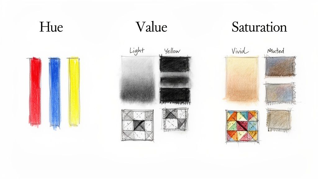
The Three Properties of Color
Every single color, whether it's in a bolt of fabric or a spool of thread, can be broken down into three key properties. Once you get these, the color wheel for quilters becomes your best friend.
A quick way to understand these three properties is to see them in action. This table breaks down what they are and, more importantly, why they matter when you're standing in front of that glorious wall of fabric at the quilt shop.
Hue Value and Saturation in Fabric Selection
| Color Property | What It Means | Why It Matters in Quilting |
|---|---|---|
| Hue | This is simply the color’s name. Think red, blue, green. | It's the starting point! Your hue choices set the overall color story of your quilt. |
| Value | The lightness or darkness of a color. | This is the MVP. Value creates contrast, which is what makes your pieced pattern pop. |
| Saturation | The brightness or dullness of a color. | Saturation sets the mood—vibrant and energetic, or soft and calming. |
Getting a feel for these three elements transforms how you shop. For example, have you ever made a quilt where all the pieces just seemed to blend together? That's often a value problem. A quilt made with fabrics that have different hues but the same value will look "muddy" because there’s no contrast to define the shapes.
The most stunning quilts are often born from a masterful play of value. A well-planned contrast between light and dark fabrics will make your design sing, regardless of the specific hues you choose.
The Building Blocks of the Color Wheel
The color wheel itself is built on a really simple, logical system. Understanding this structure is what lets us create those gorgeous, harmonious color palettes later on.
- Primary Colors: These are the big three: Red, Yellow, and Blue. You can't mix other colors to get them; they're the foundation of everything.
- Secondary Colors: Mix two primaries, and you get a secondary. Red + yellow = Orange. Yellow + blue = Green. Blue + red = Violet. Simple!
- Tertiary Colors: This is where things get more nuanced. Mix a primary color with the secondary color right next to it, and you get a tertiary. Think red-orange, yellow-green, or blue-violet.
These 12 colors make up the standard color wheel that guides artists and designers everywhere. The principles of creating balance and mood are pretty universal, and you can see them applied in other creative fields by exploring resources on general interior color theory and schemes.
Building Palettes with Classic Color Harmonies
This is where the real fun begins. It’s the moment you take all that color theory and start turning it into tangible, beautiful stacks of fabric. Classic color harmonies, which are pulled right from the color wheel, are like time-tested recipes for creating stunning quilts. Think of them as your secret weapon for walking out of bsewinn.com with a fabric pull that feels intentional and just works.
These aren't meant to be restrictive rules, but rather starting points. They give you a game plan, simplifying what can sometimes feel like an overwhelming number of choices. You’ll find your fabric shopping trips become way more focused, successful, and honestly, a lot more fun.
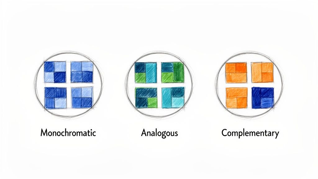
The Sophistication of Monochromatic Palettes
A monochromatic scheme is built by choosing fabrics from a single color family—just different shades, tints, and tones of it. Picture a quilt made entirely of blues, from a whisper-soft baby blue all the way to a deep, stormy navy. This approach gives you an incredibly chic and unified look.
This harmony is a dream for modern or minimalist quilts where the design and texture do most of the talking. The absolute key to making a monochromatic quilt sing is strong value contrast. If you don’t have a good mix of light, medium, and dark fabrics, your beautiful piecing will turn into a sea of mush.
- Tangible Example: For a green quilt design, you can replicate this by pulling a pale mint, a mid-tone olive, a zesty lime for a pop of energy, and a deep forest green. That range of values is what will make every single block and seam stand out.
Creating Serenity with Analogous Colors
If you're after a calm, harmonious vibe, look no further than an analogous palette. This just means picking two to four colors that are neighbors on the color wheel, like yellow, yellow-green, and green. Since they all share a common color, they blend together effortlessly.
This harmony often shows up in nature. Think of the shifting colors of a sunset (yellow, yellow-orange, orange) or the rich tones of a forest (blue-green, green, yellow-green). It's a fantastic choice for creating a gentle, flowing design that feels deeply connected.
My best advice here is to let one color be the star of the show and use the others in supporting roles. For instance, in a red, red-violet, and violet palette, you might decide to make red your dominant color to guide the eye through the quilt.
A little pro tip for analogous palettes: try to stick with either all warm colors or all cool colors. This really amps up that cohesive feeling and keeps the palette from looking muddled.
Making a Statement with Complementary Colors
Ready to make a quilt that absolutely pops with energy? A complementary color scheme is your best friend. This harmony uses two colors sitting directly opposite each other on the color wheel, like the classic duos of blue and orange or red and green.
When you place these colors side-by-side, they create the strongest possible contrast, making each one seem brighter and more vibrant. It's an amazing trick for drawing the eye and making a bold statement, especially in intricate patterns where you want every piece to be noticed.
Be warned, though—a little goes a long way. To keep your quilt exciting instead of overwhelming, try a couple of these tricks:
- Pick one color to be the main focus and use its complement as an accent.
- Play with value and saturation. A pale, dusty blue next to a rich, bright orange will feel much more sophisticated than two super-saturated colors screaming at each other.
These classic harmonies are a fantastic foundation for your quilting journey. Once you get the hang of them, you can explore so many other exciting color combinations for quilts and really start to develop your unique style. For anyone wanting to take a deeper dive, there are great resources on advanced techniques for color palette building that can be incredibly valuable.
Once you’ve nailed the basics, it’s time to really start playing. Moving beyond the classic color harmonies opens up a world of more complex, dynamic relationships on the color wheel. This is where you can craft quilts that are not just beautiful, but truly sing with life and personality.
These advanced schemes are your ticket to building richer, more complex color stories. They might take a little more thought to get the balance just right, but believe me, the results are often breathtakingly original.
The Playful Energy of a Triadic Scheme
A triadic harmony is built from three colors that sit evenly spaced from each other on the color wheel, forming a perfect triangle. The most classic example is the primary colors—red, yellow, and blue. You can also use the secondary colors—orange, green, and violet. No matter which you choose, the combination is naturally vibrant and feels inherently balanced.
Because these colors are so distinct, a triadic palette instantly creates a high-energy, playful mood. It’s a fantastic choice for a child’s quilt or any project where you want a pop of cheerful, lively energy.
The secret to making it work? Don't let the colors fight for attention. Let one take the lead.
- Pick a Dominant Hue: Choose one of the three to be the star of your quilt, using it for the largest areas or most prominent blocks.
- Let the Others Be Accents: The other two colors should serve as supporting actors, sprinkled in to add pops of interest without creating chaos.
For instance, if you're working with red, yellow, and blue, you could make blue the main color for your larger patchwork pieces, then use smaller blocks of red and yellow as accents. This way, the design feels energetic but not overwhelming.
The Split-Complementary: A Subtler Contrast
Do you love the bold pop of a complementary scheme but wish it had a bit more nuance? The split-complementary harmony is your new best friend. To build this palette, you start with one main color. Then, find its direct opposite on the wheel, but instead of using that color, you select the two colors right next to it.
Let's say your main color is blue. Its complement is orange. For a split-complementary scheme, you'd skip the orange and instead grab its neighbors: yellow-orange and red-orange. This gives you that high-contrast look you love, but in a way that feels softer and more sophisticated than a straight-up complementary pairing.
This harmony is a quilter’s secret weapon. It delivers a stunning visual punch but is so much easier to balance. You get a palette that feels both daring and deliberate.
This is where having a good color tool becomes invaluable. The quilting community is huge—over 27 million people in the United States alone—and so many of us rely on tools like a good color wheel for quilters. The industry-standard Ives Color Wheel is fantastic for this, offering distinct color chord options—including split-complementary and tetradic—that help you pull together proven, harmonious fabric palettes. It's one of the tools that continues to shape modern quilting.
The Rich Complexity of the Tetradic Scheme
For the truly adventurous quilter, the tetradic (or rectangular) scheme offers the richest potential for telling a complex color story. This harmony uses four colors arranged into two complementary pairs, forming a rectangle on the color wheel. An example would be pairing blue and orange with yellow-green and red-violet.
Because you're juggling four different colors, a tetradic palette can be a bit tricky to balance. If you use all four in equal amounts, your quilt can end up looking disorganized. The secret, again, is creating a clear hierarchy.
A great way to approach this is by paying close attention to color temperature. Try letting either the warm colors (like your orange and red-violet) or the cool colors (blue and yellow-green) dominate the quilt. This creates an underlying unity that holds the whole design together, allowing the other colors to shine as beautiful accents.
Comparing Advanced Color Harmonies
Choosing the right advanced scheme often comes down to the mood you want to create. This quick table breaks down the unique personality of each one to help you decide.
| Harmony Type | Description | Best For Creating... | Example Colors |
|---|---|---|---|
| Triadic | Three colors evenly spaced on the wheel | Vibrant, balanced, and playful designs | Red, Yellow, Blue |
| Split-Complementary | One main color + the two neighbors of its opposite | High contrast with more nuance and versatility | Blue, Yellow-Orange, Red-Orange |
| Tetradic | Four colors in two complementary pairs | Rich, complex, and sophisticated palettes | Blue, Orange, Yellow-Green, Red-Violet |
Ultimately, mastering these advanced schemes is about giving you the confidence to create quilts that are uniquely yours. At bsewinn.com, we are dedicated to supporting that creative journey with comprehensive training and resources to help you tackle even your most ambitious projects.
From Fabric Pull to Quilt Top: Making the Theory Real
Okay, theory is great, but let's be honest—the real fun begins when you're standing in front of a pile of beautiful fabric. This is the moment your knowledge of the color wheel for quilters goes from an idea in your head to something you can actually touch. Let's walk through how I approach this, turning those color choices into a quilt top you'll absolutely love.
This isn't a strict set of rules. Think of it more as a flexible game plan, a way to help you make decisions confidently, from that very first fabric you grab to the final stitch.
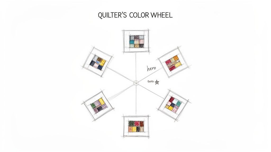
Start with Your Hero Fabric
Almost every quilt I make starts with one specific fabric. It's what I call the "hero fabric"—that one print I stumbled upon, fell in love with, and just had to have. It could be a show-stopping floral, a funny novelty print, or a batik with a gorgeous blend of colors. Whatever it is, this fabric is now the anchor for your entire palette.
Once you’ve got your hero, spread it out and take a good, hard look. What colors do you see? A great little cheat sheet is hiding right on the selvage edge. Manufacturers often print small color dots showing every ink used in the design. It's a perfect shortcut for building out your scheme.
- Identify the Main Colors: What are the most dominant hues jumping out at you?
- Look for Accent Colors: Now hunt for those smaller, more subtle colors that add that extra bit of sparkle.
- Decide on a Harmony: Let your hero fabric point the way. If it’s loaded with blues and oranges, a complementary scheme is practically begging to be used. If it's a sea of beautiful greens and teals, an analogous palette will be stunning.
Build Your Supporting Cast
With your star chosen and a color harmony in mind, it's time to gather the supporting cast. This is when you start pulling solids, blenders, and other prints that will make your hero fabric shine without stealing the spotlight. You're aiming for a collection that feels balanced and looks like it was meant to be together.
I like to think of it like casting a movie. You've got your lead actor; now you need talented co-stars who enhance the story. A mix of print scales is also key here. If your hero is a huge, bold print, you’ll want to balance it out with some smaller-scale prints and solids to give the eye a place to rest.
My secret to a dynamic fabric pull? Variety in both texture and scale. I always mix large prints with tiny ditsy florals, throw in some geometric patterns next to organic blenders, and add pure solids. This is what adds that rich visual texture that keeps you looking at a quilt.
The Make-or-Break Role of Value
I've said it before, but it bears repeating because it's probably the single most important tip for a quilt that sings: pay attention to value. Value—simply the lightness or darkness of a fabric—is what makes your piecing pop. If all your fabrics are sitting in that same medium-value zone, your design will turn to mud and all your hard work will get lost.
Here's my favorite quick trick: pull out your phone and snap a black-and-white photo of your fabric stack. It instantly removes the color and shows you the true value of each piece. You should see a nice range of lights, mediums, and darks. If it all just looks like a sea of gray, you know you need to go back and find more contrast.
Auditioning and Finalizing Your Choices
Before a single rotary cutter blade touches fabric, it's audition time. Lay everything out on a design wall or a clean spot on the floor. Now, step way back. How do the fabrics play together from a distance?
Here are a few final checks I run through before I commit:
- Check the Light: Look at your pull in different lighting. Colors can shift dramatically from natural daylight to the warm glow of your sewing room lamp.
- Consider Your Thread: Don’t forget that your quilting thread is another color choice! Will you go with a neutral that blends in, or maybe a contrasting color to add another design element?
- Think About Fabric Type: Try to work with consistent materials if you can. For a deeper dive into why so many of us stick with one particular type, check out our guide on what quilting cotton fabric is—it explains why its stability and incredible color range make it a quilter’s best friend.
Here at bsewinn.com, we know this creative process is a journey. Our project galleries and online classes are here to give you that extra spark of inspiration, helping you see what’s possible and giving you the confidence to bring your own beautiful quilt to life.
Common Questions About the Quilter's Color Wheel
Even after you feel like you've got a handle on color theory, questions always pop up the second the fabric is actually in your hands. It's one thing in theory, and another thing entirely when you're staring at a stack of prints! Let's walk through some of those common hurdles—clearing them is the final step to really owning the color wheel and quilting with confidence.
Think of this as your troubleshooting guide. These are the questions I hear all the time, and the answers will help you push past any hesitation and get back to creating.
How Do I Choose a Background Fabric?
This is a big one. Picking a background that makes your quilt top sing is all about value contrast. The background’s job isn’t to steal the show; it’s to make your main fabrics look their absolute best. If your primary fabrics are mostly medium to dark, a light-value background will create that crisp, clean look that really lets the pattern pop.
On the flip side, if your quilt is full of soft pastels or light, airy prints, a darker background can be incredibly dramatic and beautiful. It creates a bold frame for those delicate colors. And here's a pro tip: when in doubt, a neutral gray is a quilter’s best friend. It plays nicely with almost everything and lets the other colors shine without messing with their warm or cool vibes.
Can I Mix Warm and Cool Colors?
Oh, absolutely! In fact, you should. Mixing warm colors (your reds, oranges, and yellows) with cool colors (blues, greens, and purples) is one of the best ways to create balance, depth, and a whole lot of visual interest in a quilt. The key to making it work is to decide on a dominant temperature.
- Pick a Lane: First, decide if you want the overall feel of the quilt to be warm and cozy or cool and serene. This will be your dominant color temperature.
- Add a Spark: Then, use the opposite temperature for your accents. A little sprinkle here and there is all it takes to guide the eye and add that extra spark. Imagine a quilt that’s mostly cool blues and greens—a few small, strategic pops of a warm orange will make the whole thing come alive.
Why Does My Quilt Block Look Muddy?
We’ve all been there. You spend hours cutting and piecing, only to step back and find your design looks… well, muddy. This is one of the most common frustrations for quilters, and a lack of value contrast is almost always the culprit.
When all your fabrics are sitting in the same value range (meaning they have a similar lightness or darkness), they just blend together visually, even if the actual colors are different. Your beautiful piecing gets lost.
The fix is surprisingly simple. Before you even think about cutting, make sure your fabric pull has a healthy mix of lights, mediums, and darks. The easiest way to check? Lay your fabrics out and take a black-and-white photo with your phone. This little trick strips away the color and instantly shows you if you have enough contrast to make your pattern clear and defined.
You can think of the fabric selection process as a simple workflow, starting with your inspiration fabric and ending with that crucial value check.
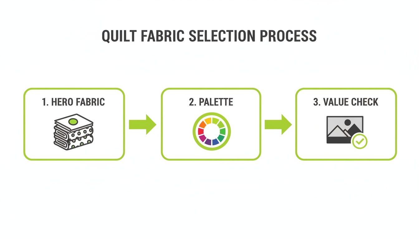
As you can see, that value check is the last gatekeeper. It’s what ensures the gorgeous palette you built from your hero fabric will turn into a dynamic quilt top, not a muddled mess.
At bsewinn.com, we're passionate about supporting every step of your creative journey. Whether you need the perfect machine, an online class to build your skills, or just the right supplies, we're here to help you get beautiful, professional-level results. Check out our huge selection of machines, fabrics, and educational events to get inspired for your next project at https://www.bsewinn.com.

