

Ever look at a quilt and just wonder, how did they do that? The colors flow so perfectly they almost look painted on. The secret isn't magic—it's the quilting color wheel. It might sound a little intimidating, but it's actually a simple tool that can totally transform how you choose your fabrics for any sewing machine design.
We're going to break down color theory and turn it into your new best friend for creating quilts that truly sing. This comprehensive how-to guide will show you tangible examples you can replicate to build your color confidence.
Why the Color Wheel is a Quilter’s Best Friend
Think of the color wheel as your roadmap to amazing fabric pulls. It’s not some stuffy, abstract art concept; it's a practical guide that shows you exactly how colors relate to each other. Once you get the hang of it, you can move past just guessing and start building palettes with confidence—whether you want harmony, drama, or that perfect pop of visual interest.
Here at B-Sew Inn, we're committed to empowering you through our custom sewing machine designs and extensive resources. Our goal is to give you the skills and tools to bring your creative ideas to life. From our supportive online classes to our training on your new sewing machine, we're here to help you tackle any project, especially mastering color. Consider this your personal, step-by-step journey into the world of color theory for quilters. You'll walk away ready to build fabric palettes that wow.
A Tool with a Rich History
Believe it or not, the color wheel has been a core tool for artists and designers for centuries. It actually dates back to 1666 when Sir Isaac Newton first sketched out a circular diagram of hues after splitting light with a prism. That same invention is still helping quilters across the globe pull fabrics and create stunning, cohesive quilts. It’s pretty amazing to think about, and you can read more about its fascinating journey and see what Newton’s original wheel looked like.
The quilting color wheel isn't about memorizing rigid rules. It’s about understanding relationships. It’s the key that unlocks intentional, beautiful designs that feel like you—whether you’re going for a soft, harmonious blend or a bold, high-contrast statement.
By the end of this guide, you’ll see your fabric stash in a completely new light. You'll learn how to choose fabrics not just because you love them individually, but because you know exactly how they’ll work together to create something incredible.
Understanding the Language of Color
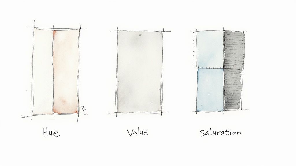
To build a quilt that truly sings, you first have to get comfortable with the language of color. It's your most important material, after all. Just like learning a few key quilting terms helps you make sense of a new pattern, understanding three simple ideas will completely change how you pick out fabrics. Those three concepts are Hue, Value, and Saturation.
Think of these as the fundamental building blocks for every gorgeous fabric pull you’ll ever create. Getting a good handle on them is the first real step toward moving from just liking a fabric to knowing exactly why it works in your quilt.
The Three Pillars of Color Theory
Let's break these down in a way that makes sense for a quilter. Once you start seeing your fabric stash through this lens, you’ll never look at it the same way again.
Here's a quick cheat sheet to get you started.
Core Color Concepts Explained
| Concept | Simple Definition | Quilting Application |
|---|---|---|
| Hue | The pure color family (e.g., red, blue, green). | This is the actual color you're choosing—the starting point of your palette. |
| Value | How light or dark a color is. | Crucial for making your design pop. It’s what creates contrast and definition. |
| Saturation | How bright or muted a color is. | Determines the mood. Bright, saturated colors feel energetic; muted tones feel calm. |
Let's dig a little deeper into what these really mean for your projects.
-
Hue: The Color Itself
This one's the easiest of the bunch. Hue is just the basic name of a color—red, yellow, blue, and so on. When you look at a classic quilting color wheel, you're looking at a circle of pure hues. It's the most straightforward part of picking fabrics. -
Value: The Secret Sauce
If there's one concept to master, it's value. This is all about how light or dark a color is, completely separate from its hue. A great trick is to take a black-and-white photo of your fabric pull. The range you see, from nearly white to deep, dark gray, is your value range. Strong value contrast is what makes the sharp points of a star block stand out or the intricate lines of a paper-pieced pattern come to life. -
Saturation: The Color's Personality
Saturation describes a color's intensity. Is it a screaming, vibrant, fire-engine red, or is it a soft, dusty barn red? Highly saturated colors jump forward and demand attention, making them perfect for focal points. Less saturated, muted colors tend to recede, creating a calmer, more subtle backdrop.
These ideas aren’t new, of course. Sir Isaac Newton first documented how light splits into colors back in his 1704 book, Opticks. Since then, developments in pigments have given us the incredible rainbow of fabrics we quilters get to play with today.
Pro Tip: Don't trust your eyes alone to judge value! It's easy to get tricked. Grab a red or green value-finder tool, or just snap a quick photo of your fabrics on your phone and switch it to monochrome. This one simple step can instantly show you if you have enough light-and-dark contrast to make your pattern shine.
Here at B-Sew Inn, we truly believe that understanding these fundamentals is what gives you creative freedom. Our online classes and other extensive resources are all designed to build your confidence, helping you create quilts that are not just beautiful, but also thoughtfully designed.
Choosing Your Perfect Color Harmony
Now that you've got the language of color down, it’s time for the really fun part—playing conductor for your own fabric orchestra. A color harmony is simply a time-tested color combination from the quilting color wheel that creates a specific mood or feeling. Think of these as proven recipes for beautiful quilts.
Instead of just guessing which fabrics will play nicely together, you can use these harmonies to build palettes with purpose. Whether you want a quilt that feels electric and vibrant or one that’s calm and soothing, the right color harmony will get you there. This is where your creative vision really starts to take shape.
Here at B-Sew Inn, we are dedicated to empowering crafters with the know-how to make creative choices with confidence. Our online classes, training, and extensive resources are all designed to help you move beyond the basics and master skills like color selection, turning that sewing machine into a tool for true artistry.
Complementary Colors for High Contrast
If you want your quilt to have some serious energy and drama, look no further than complementary colors. These are any two colors that sit directly across from each other on the color wheel, like blue and orange or red and green.
This pairing creates the strongest possible contrast, making each color appear brighter and more intense when placed side-by-side. It’s a fantastic choice for designs where you want your piecing to pop and grab everyone's attention. Just imagine a quilt with sharp, geometric orange blocks against a deep blue background—that's a recipe for undeniable visual sizzle.
Analogous Colors for a Serene Blend
For a softer, more blended effect, an analogous color scheme is just perfect. This harmony uses three colors that are neighbors on the quilting color wheel, like yellow, yellow-green, and green.
Because these colors are so closely related, they create a gentle, cohesive feel that’s easy on the eyes. This approach is ideal for quilts that are meant to feel calming and subtle, like a beautiful landscape quilt or a delicate floral appliqué project. The result is always graceful and sophisticated. We explore even more stunning color combinations for quilts in our dedicated guide.
A key aspect of color theory is rooted in how we perceive it. While traditional artist wheels are common, many modern quilters use systems like the Munsell Color Wheel, which is based on human perception of hue, value, and chroma. Learn more about how this scientific approach is used in fiber arts.
Triadic Colors for Balanced Vibrancy
When you’re after a palette that's colorful and lively but still feels balanced, a triadic harmony is your go-to. This scheme uses three colors that are evenly spaced around the color wheel, forming a triangle. The classic example is the primary trio of red, yellow, and blue.
Triadic palettes are inherently vibrant and playful, making them perfect for children’s quilts, modern designs, or any project that needs a dose of cheerful energy. The trick is to let one color take the lead while the other two act as accents. It's interesting to see how these principles of visual harmony extend beyond fabric, like when professionals are tasked with selecting the right product photography backdrop to make an item stand out.
How to Build a Fabric Palette from Scratch
Okay, this is where the magic really starts—turning all that color theory into an actual stack of fabric you can't wait to sew. This how-to guide will walk you through a simple, repeatable process for pulling a gorgeous palette every single time, taking the guesswork out of it.
The secret? Let one amazing fabric do all the hard work for you. The easiest way to start is with what quilters call a focus fabric. Find a multi-colored print that just makes your heart sing. Seriously, that’s the only rule. This one piece of fabric is about to become your roadmap, giving you a built-in color scheme for a perfectly coordinated quilt.
Start with Your Focus Fabric
Think of your focus fabric as the anchor for your entire project. It sets the mood and tells the color story, so once you have it, the rest of the choices get a whole lot easier.
Spread your focus fabric out and take a good look. What are the main colors you see in the print? Those are going to be the foundation for everything else. Now, start pulling potential coordinates from your stash or off the bolts at the shop. Lay them right next to your main print and just see how they play together.
Balance Your Prints and Values
A truly stunning quilt palette isn't just about color. It's also about the mix of print scale and value. You need a little bit of everything to create that delicious visual texture that makes a quilt interesting and keeps it from looking muddy or chaotic.
Try to get a healthy variety of prints going:
- Large-Scale Prints: This is often your focus fabric. It brings the drama and personality.
- Medium-Scale Prints: These guys support the star of the show without trying to steal the spotlight. They add a nice layer of texture.
- Small-Scale Prints: Think tiny dots, ditsy florals, or subtle geometrics. From a few feet away, they often read as a solid color, but up close they add a secret layer of interest.
This little infographic is a great cheat sheet for using classic color harmonies to pull coordinates from your focus fabric.
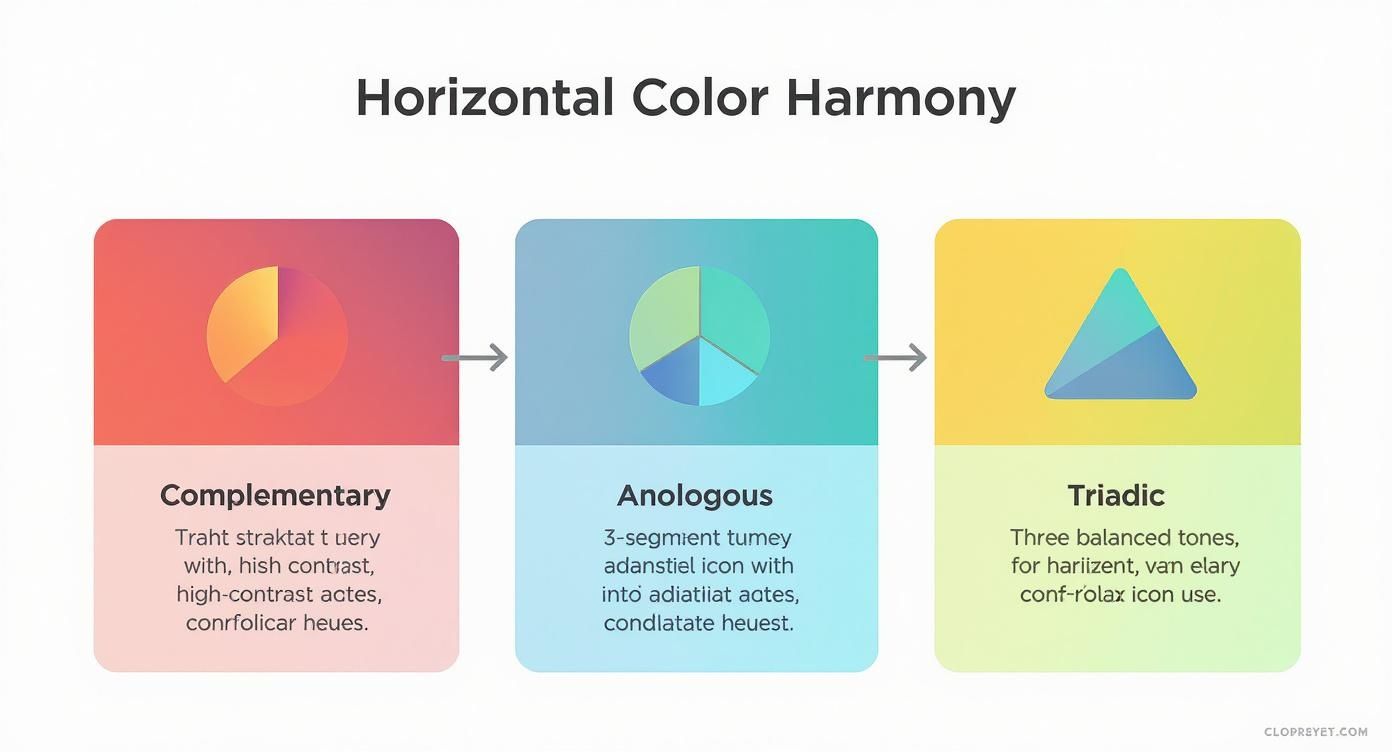
It’s a handy visual for understanding how complementary, analogous, and triadic color schemes work to create either punchy contrast or soothing harmony. These are time-tested recipes for success!
Build Out Your Palette Systematically
With your focus fabric picked out, grab your quilting color wheel and start auditioning the supporting cast. Try pulling a dark, a medium, and a light version of two or three of the main colors you see in that print. Making sure you have that range of value contrast is what will make your piecing pop and look crisp.
And don't forget your solids and blenders! These are the unsung heroes of a quilt. They give your eyes a place to rest, calm down the busier prints, and let those gorgeous focus fabrics really shine. This same idea applies to your thread, too. If you want to go deeper, check out this handy embroidery thread color chart to see how those principles translate.
A great palette tells a story through color, value, and print scale. If every fabric is a bold, large-scale print, the quilt can feel overwhelming. If everything is a tiny print, it can look muddy. The magic happens in the mix.
If you’re a visual person, you might get a kick out of these interior design mood board examples. The process of gathering textures, colors, and inspiration is so similar to pulling a fabric palette. Here at B-Sew Inn, we love empowering quilters through this process! With our support and resources, you'll find coordination a breeze, and our team is always here to help you find that one perfect blender to tie your whole vision together.
Putting Color Theory into Practice
Alright, let's get to the good stuff. Theory is great, but seeing a quilting color wheel actually guide your fabric choices is where the real magic happens. This is all about watching a single quilt pattern completely transform, just by telling a different color story.
We're going to take one classic quilt block and show you how to create it using three totally different color harmonies. Think of these as tangible examples you can replicate, proving just how much punch a well-planned palette can pack. At B-Sew Inn, we're all about empowering you with that "aha!" moment, and our online classes are the perfect place to get the hands-on training to bring these ideas to life on your own sewing machine.
Example 1: The Bold Complementary Block
Let’s start with a simple Nine Patch block. Now, how do we make it really sing? A complementary color scheme is the answer. We’ll grab a deep, vibrant navy blue and a rich, rusty orange—two colors that sit directly across from each other on the color wheel.
- Fabric A (Navy): This will be our anchor, filling the four corner squares and the center. I'd pick a small-scale geometric print in navy to add a little texture without stealing the show.
- Fabric B (Orange): This high-contrast orange is for the remaining four squares. A fabric with a subtle tone-on-tone pattern will keep it interesting without looking flat.
The result is a block that practically crackles with energy. That orange seems to leap right off the navy background, creating a design that's dynamic and impossible to ignore. This is exactly the kind of high-contrast approach you want for a sewing machine design that needs to make a statement.
Example 2: The Soft Analogous Block
Using that very same Nine Patch pattern, let's create a completely different vibe. This time, we'll use an analogous palette. This harmony pulls colors that are neighbors on the wheel, creating a much gentler feel. I'm thinking a soothing trio of sage green, gentle teal, and soft sky blue.
- Fabric A (Sage Green): This will be our main color for the corners and center. A light, leafy print would be just beautiful here.
- Fabric B (Teal & Sky Blue): We’ll alternate the other squares with a medium-value teal blender and a light sky blue solid.
This version feels calm, cohesive, and incredibly serene. The colors just melt into one another, creating an almost watercolor-like effect. It's the perfect scheme for a quilt meant to feel peaceful and relaxing, and an excellent example of how to replicate a specific mood with your fabric choices.
The same block, three different personalities. This is the core lesson of the quilting color wheel—it’s not just about picking pretty colors, but about choosing the right emotions for your project.
Example 3: The Vibrant Triadic Block
Last but not least, let's inject some playful fun with a triadic scheme. This balanced yet lively harmony uses three colors that are evenly spaced on the wheel. We'll go with a cheerful trio of magenta, golden yellow, and bright turquoise.
The key to a triadic palette is letting one color take the lead to avoid chaos.
- Fabric A (Magenta): We’ll make this our dominant color for the corner and center squares.
- Fabric B (Yellow & Turquoise): These will be our accent pops, filling the other four spots.
What we get is a block that feels joyful, balanced, and just bursting with life. It’s a fantastic choice for a modern baby quilt or a throw that’s meant to brighten up a room. Each color gets its moment to shine, yet they all work together in perfect harmony, proving you can be dynamic without overwhelming the eye.
Quilt Project Color Scheme Comparison
It can be hard to visualize how these harmonies change a project until you see them side-by-side. This little chart breaks down how different color schemes can dramatically alter the look and feel of the exact same quilt block design.
| Color Scheme | Key Characteristics | Best For Creating a Mood Of... |
|---|---|---|
| Complementary | High-contrast, uses colors opposite each other on the wheel. Creates a strong visual pop. | Energy, excitement, drama, and modern boldness. |
| Analogous | Low-contrast, uses 2-4 colors that are neighbors on the wheel. Creates a unified, blended look. | Calm, serenity, harmony, and peacefulness. |
| Triadic | Balanced and vibrant, uses three colors evenly spaced on the wheel. One color usually dominates. | Playfulness, joy, balance, and cheerful energy. |
| Monochromatic | Uses tints, tones, and shades of a single color. Creates depth and sophistication. | Elegance, subtlety, and a focused, modern feel. |
| High-Contrast | Uses light and dark values (like black and white) for maximum visual impact. | Graphic power, clarity, and striking visual interest. |
As you can see, your color choices are one of the most powerful tools in your quilting toolbox. They do more than just make a quilt pretty—they give it a voice and a personality.
Your Quilting Color Questions Answered
Even with a color wheel in hand, there's always that moment of hesitation when you're standing in front of your fabric stash. Moving from color theory to a real-life stack of fabric can feel like a huge leap, but trust me, a few practical tips are all you need to start building gorgeous palettes with confidence.
Let's dive into some of the questions I hear most often from fellow quilters. Think of this as your personal color FAQ—just straightforward advice for your next project.
How Do I Pick the Right Background Fabric?
This is one of the biggest decisions you'll make for your quilt top! Your background fabric sets the stage for everything else, so it's a crucial choice. The secret ingredient here is value.
A background that has a strong value contrast with your main fabrics—meaning it's much lighter or much darker—will make your piecing pop and look super crisp.
Here’s a great trick: snap a quick black-and-white photo of your main fabrics next to your potential background. If the background just sort of blends in, your design could get lost. If it stands out and creates a clear separation, you've got a winner.
What Are Low Volume Fabrics and How Do I Use Them?
You've probably heard this term a lot! Low volume fabrics are simply prints on a very light background (like white, cream, or pale gray) where the pattern itself is really subtle. We're talking tiny polka dots, faint text prints, or delicate tone-on-tone florals.
They are absolute magic for backgrounds. Low volumes add a wonderful layer of texture and interest without screaming for attention or competing with your main design. You can even mix a whole bunch of different low volume prints together for a scrappy background that reads as one cohesive, textured element from a distance.
Can I Mix Warm and Cool Colors in the Same Quilt?
Yes, absolutely! In fact, you should. Pairing warm colors (reds, oranges, yellows) with cool colors (blues, greens, purples) is one of the best ways to create energy and depth in a quilt. This is the whole idea behind a complementary color scheme, which uses one warm and one cool color to create maximum impact.
The key to mixing temperatures successfully is to find a good balance. A great approach is to let one temperature be the star of the show, making up most of the palette, while using the other as a fun accent. This keeps the quilt feeling cohesive but still dynamic and exciting.
Is There a Rule for How Many Fabrics to Use?
There are no hard-and-fast rules in quilting, but there are some helpful guidelines! For beginners, I often recommend the "Rule of Three" for print scale: try to include a large-scale print, a medium-scale print, and a small-scale print. This little recipe creates instant visual balance and stops the quilt from feeling either too chaotic or too flat.
As for the total number of fabrics? That's totally up to you and your pattern. A bold, graphic quilt might only need 3 or 4 fabrics to make its statement. A complex, scrappy quilt, on the other hand, could easily have over a hundred! What matters most is that you have a good range of values to make your design truly shine.
At B-Sew Inn, we’re here to support you on every step of your creative journey. Our commitment is to empower you with the skills and confidence to create beautiful sewing machine designs. Explore our huge selection of sewing machines, supplies, and online classes designed to help you bring your most colorful ideas to life.

