

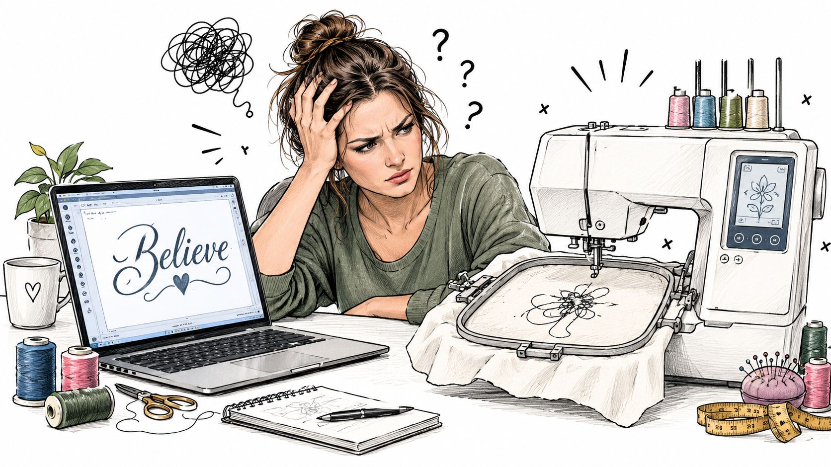
A regular computer font can look perfect on a laptop and fail completely on a finished project. An embroiderer may download an elegant script, open a design file, and discover that the machine can't read it. After conversion, the letters may crowd together, lose their thin strokes, or turn into a dense patch of thread.
That frustration comes from treating visual lettering and stitched lettering as the same thing. Embroidery machine fonts are engineered stitch data, not ordinary typefaces. The right choice depends on the machine brand, file format, software workflow, fabric, stabilizer, and physical size of the lettering.
Table of Contents
- Understanding Embroidery Fonts in Practice
- How Computer Fonts Become Embroidery Files
- Major File Formats and Machine Compatibility
- Native Systems Versus Converted Desktop Fonts
- Sizing, Density, and Legibility Guidelines
- Font Selection for Different Project Types
- Installing and Customizing Your Font Library
- Next Steps for Your Embroidery Journey
Understanding Embroidery Fonts in Practice
A regular computer font tells a screen how to display an outline. An embroidery font must tell a needle where to travel, which stitch type to use, how densely to place thread, and how to build each character so it remains recognizable on fabric. A font downloaded from a general font website doesn't contain that production information, so it can't normally go straight from a computer into an embroidery machine.
The problem becomes obvious with a small script name on a sweatshirt. On screen, the letters may have delicate loops and narrow joins. Once digitized, those joins can close up, the thread can spread into neighboring strokes, and the smallest details can disappear. The issue isn't always the machine. Often, the chosen letter geometry was never suited to stitched reproduction.
Why the history still matters
Traditional hand embroidery has existed for thousands of years, while machine embroidery is about 200 years old. A research paper dates the first hand-embroidery machine to 1828 and describes later software that converts TrueType characters into stitch patterns in its discussion of machine embroidery development.
That shift changed lettering permanently. A hand embroiderer can adjust every stitch while working. A computerized machine needs a prepared file that translates the character into repeatable movement. Modern alphabets therefore depend on digitization, not merely on attractive letterforms.
What the embroiderer should check first
Before buying or downloading a font, the practical questions are:
- Machine format: Does the file include the format required by the machine?
- Target size: Was the alphabet digitized for the physical size needed?
- Fabric behavior: Will the lettering sit on a stable woven fabric, a towel, a cap, or stretch knit?
- Workflow: Will each letter need to be placed manually, or can the software type the full word?
- Test sample: Can the design be stitched on a scrap of the same material before production?
Practical rule: A beautiful font is only a good embroidery font when its stitch behavior matches the project.
How Computer Fonts Become Embroidery Files
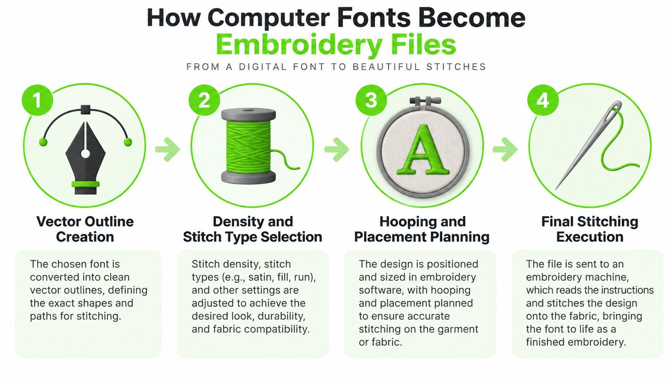
Digitization turns a visual character into a sequence of stitch instructions. The process is easier to understand when treated as a production chain rather than a simple font conversion.
Start with the letter shape
The digitizer begins with the outline of a letter. That outline is only the visual boundary. It doesn't yet specify whether the character should use satin columns, running stitches, or a fill pattern. A narrow lowercase letter may need a different construction from a broad capital, even when both belong to the same family.
Next, the digitizer assigns stitch direction, underlay, pull compensation, and density. Stitch order matters because one section can pull fabric before another section is sewn. If the order is poor, a centered name can pucker or develop uneven edges even when the on-screen preview appears balanced.
Build spacing into the result
Computer typography often treats spacing as a property of the font. Embroidery requires additional judgment because thread has physical width. A pair of letters that looks comfortably separated on a monitor may appear crowded after satin stitches spread into the fabric.
The digitizer also chooses how the machine enters and exits each letter. Those travel paths affect jump stitches, thread changes, and the continuity of curves. A well-built alphabet reduces unnecessary movement and preserves the visual rhythm of the word.
Test the actual stitch file
A preview can reveal obvious placement problems, but it can't fully show how a font behaves on a particular fabric. The embroiderer should test the finished lettering with the intended thread, stabilizer, needle, hoop, and material. A font that works on cotton may need a different approach on fleece or a towel.
For a more detailed look at the workflow, the guide to digitizing embroidery designs provides useful context around converting artwork into machine-ready embroidery. The important distinction remains consistent: a desktop outline becomes useful only after someone assigns the stitch logic that makes it sewable.
Major File Formats and Machine Compatibility
An embroidery machine doesn't read a font just because a computer can open it. The machine needs a compatible stitch file, and the required format varies by brand and production environment.
Brother and Baby Lock machines use PES in many embroidery workflows. Janome machines use JEF, while commercial Tajima-style machines commonly use DST. A font package may include several folders so the same alphabet can be prepared for different machines, but the presence of a folder doesn't guarantee that every file is suitable for every model.
| Format | Compatible Machines | Best Use Case |
|---|---|---|
| PES | Brother and Baby Lock embroidery machines | Home embroidery workflows using those machine families |
| JEF | Janome embroidery machines | Janome-specific lettering and design files |
| DST | Commercial Tajima-style machines | Commercial production and broad machine interchange |
| BX or other installable systems | Compatible embroidery software | Typing and arranging digitized lettering before export |
A general font website's TTF or OTF file isn't a finished embroidery file. Each character must be digitized before the machine can stitch it, as explained in this overview of embroidery font formats and machine requirements. That conversion step is where stitch type, density, underlay, and size range are assigned.
A practical compatibility check
The safest process starts with the machine manual and the software export menu. The embroiderer should identify the machine's native format, confirm the hoop dimensions, and then select a font package that includes either the required stitch files or a compatible installable font system.
A conversion tool can change the file container, but it can't automatically fix poor digitization. Converting a badly built alphabet from one format to another may produce a file the machine recognizes while leaving the lettering too dense, too small, or poorly sequenced.
The embroidery machine design software guide is useful when a reader needs to decide whether the current workflow provides enough control over lettering, spacing, alignment, and export. For occasional monograms, a simple setup may be enough. A small business producing names across multiple brands needs a more deliberate file-management system.
Native Systems Versus Converted Desktop Fonts
Native font systems and converted desktop fonts solve different problems. A native system is built for an embroidery software environment, while a converted desktop font begins as a visual typeface that must be interpreted and digitized before stitching.
Native systems prioritize speed and repeatability. Embrilliance reports that Essentials launched in December 2010 with its first object-based fonts, followed later by the BX installer and a stitch-based font format that lets users type decorative letters directly. Its Express Mode was designed as a free lettering program for BX installable fonts, according to the company's account of that development.
A BX alphabet can bundle a complete letter set into one installable file. That makes it practical for repeated names, monograms, and customer orders. The drawback is ecosystem dependence. The file is useful inside compatible software, but it still must be exported into the machine's required PES, JEF, DST, or other stitch format before production.
Converted desktop fonts offer a different advantage. They can be easier to move between general design environments, but the embroiderer must account for digitization quality, sizing limits, stitch parameters, and manual placement. A TTF or OTF workflow may appear more portable while creating more setup work for each design.
Which workflow suits which user
| Workflow priority | Native font system | Converted desktop font |
|---|---|---|
| Fast name entry | Strong choice when the software supports typing | Usually requires more preparation |
| Multiple machine brands | Export still needs brand-specific formats | Flexible only when the digitization workflow is reliable |
| Repeated customer orders | Efficient for saved layouts and consistent lettering | Can work well with organized templates |
| Lowest software dependence | May create more ecosystem lock-in | May require separate conversion or digitizing tools |
| Quality control | Often more predictable when professionally digitized | Depends heavily on the conversion and settings |
A hobbyist who personalizes occasional gifts may value simplicity over portability. A small shop working with several machine brands should prioritize export compatibility, dependable sizing, and a library that can be reused without rebuilding every name. The explanation of embroidery digitizing helps clarify why a font choice is also a production decision.
Sizing, Density, and Legibility Guidelines
A font can be technically compatible and still be the wrong choice for the intended size. Small lettering leaves little room for thread movement, fabric distortion, and pull compensation. The safest selection starts with letter geometry, then moves to density and stabilizer.
Industry guidance places practical minimums around 5 mm for block sans-serif lettering, 6 mm for bold serif lettering, and 8 mm for script styles according to this embroidery lettering guidance. Thin ornate scripts below roughly 0.25 inch, or about 6.35 mm, tend to merge or lose details during digitization. Open counters, bold strokes, and consistent widths generally survive better than narrow decorative forms.
Use density as a fabric decision
Satin lettering is often tuned around 0.4 mm stitch spacing, but the suitable setting changes with thread weight, stabilizer, and fabric behavior as described in this guide to embroidery fonts and monogramming. Excess density creates thread buildup, needle jams, and a stiff result. Insufficient density can expose the fabric through the letter.
One industry reference states that 40 wt thread should rarely exceed 0.40 mm density, while two stitched lines closer than about 0.50 mm may begin to look like a solid fill. It also identifies 0.38 mm as a common tatami setting in its discussion of lettering density and underlay problems.
Test before committing
A sample should use the same fabric and stabilizer as the final item. The embroiderer can then inspect:
- Closed counters: Are the centers of letters such as “a” and “e” still open?
- Edge definition: Do curves remain smooth, or has thread spread softened them?
- Fabric coverage: Is the background showing through the strokes?
- Backing tension: Does the fabric pucker after the hoop is removed?
- Needle performance: Did the machine sew without jams or thread buildup?
For smaller monograms, thread choice also changes the result. One trade reference recommends five-point density for size 40 thread on lettering at 3/8 inch and smaller, and four-point density for size 60 thread when sharper lettering is needed without losing fabric coverage in its monogramming guidance. Stabilizer selection remains part of the same decision, not an afterthought. The guide to using embroidery stabilizer explains why support must match the fabric and stitch load.
Font Selection for Different Project Types
The best font depends on the surface, the viewing distance, and the amount of handling the finished item will receive. A clean block alphabet may be ideal for a work jacket, while a restrained script can suit a gift towel if the lettering has enough room to maintain its joins.
Caps create a special challenge because curved panels and seams limit placement. Dense merchandise embroidery also needs a font with sturdy strokes and predictable underlay. Towels require enough separation for letters to remain visible above the pile, while stretch knits need support that prevents the lettering from distorting with the fabric.

Match the alphabet to the project
- Personal monograms: Choose open shapes and test the initials at the final physical size. A dense decorative alphabet can overpower a small pocket or cuff.
- Labels and children's garments: Favor rounded, bold lettering that remains readable after laundering and movement.
- Towels and home décor: Allow for pile and texture. A heavier letter structure generally holds its outline better than a hairline script.
- Promotional apparel: Prioritize brand consistency, repeatable sizing, and a file format that works across the machines in the production workflow.
- Decorative gifts: A script or serif can work when the lettering has sufficient room and the fabric supports clean edges.
Current design preferences are moving toward simpler sans-serif lettering, retro block styles, tone-on-tone treatments, and dimensional techniques such as 3D puff and chenille, as noted in this overview of embroidery font styles and applications. The practical lesson is broader than any trend. Legibility and surface compatibility usually matter more than decorative complexity.
A reader working on a small accessory can also find useful styling ideas in this guide to styling a personalised makeup pouch. For alphabet inspiration and project planning, the embroidery patterns alphabet collection can help narrow the visual direction before the font is digitized.
Installing and Customizing Your Font Library
A reliable font library begins with file discipline. Downloaded packages often contain folders for several machine formats, documentation, previews, and an installable font file. The embroiderer should extract the package before using it and keep the original archive in a separate backup location.
For a native installable font, the file is added through compatible embroidery software. A BX file is used to install a digitized alphabet into supported software, not sent directly to the machine. The lettering is typed or arranged on the computer, checked inside the hoop boundary, and then exported as the machine's stitch format.
A practical library structure
A useful folder system separates fonts by:
- Alphabet name: Keep the original font name visible so future files are easy to identify.
- Physical size: Record the intended size range when the supplier provides it.
- Machine format: Store PES, JEF, DST, or other files in clearly labeled folders.
- Project use: Mark alphabets that perform well on caps, towels, knits, or stable cotton.
- Test status: Keep a stitched sample or note showing which settings produced a clean result.
Customization should focus on spacing, alignment, and placement before aggressive resizing. Lowercase letters are often about 70% of capital height, according to Wilcom documentation summarized in the discussion of embroidery font development and proportions. That proportion helps explain why a lowercase word can look smaller than expected even when the capital-height setting appears correct.
When a name is built from individual letter files, each character may need to be merged, positioned, and aligned manually. Native systems reduce that labor, but the final file still needs a visual check and a test stitch. A saved layout for a recurring towel, patch, or garment can make future orders faster without forcing every project into the same font.
Next Steps for Your Embroidery Journey
Font selection becomes easier when the machine, software, and fabric are considered together. A reader comparing embroidery machines should bring a sample font or lettering project to a retail appointment and ask how the model handles built-in lettering, imported stitch files, hoop sizes, and brand-specific formats.
Hands-on testing is especially useful for buyers choosing between Baby Lock, Bernina, Bernette, Brother, and Janome machines. Retail stores in Tulsa and Oklahoma City, Oklahoma, Springfield, Missouri, Humble, Texas, and Fayetteville, Arkansas, give local shoppers a place to see, test, and try machines before making a significant purchase.
Build skill with support
An in-person machine mastery session or class can help an embroiderer practice hooping, stabilizer selection, lettering placement, and file transfer on the actual equipment. A service appointment is the right next step when thread breaks, skipped stitches, tension problems, or repeated font failures point to a machine setup issue rather than a font choice.
Readers can also browse embroidery designs, thread, stabilizer, software, and other notions through the dealer's online store or visit a retail location for guidance. The most future-proof font library isn't necessarily the largest one. It's the library that exports cleanly to the machines the embroiderer uses.
B-Sew Inn offers embroidery machines, design software, fonts, thread, stabilizer, notions, in-person classes, machine mastery sessions, service, repair, and trade-ins. Visit B-Sew Inn to browse options online or arrange hands-on help with a font workflow before the next project.

